
Hi Everyone ,
This is my 8th post for #BlogchatterA2Z challenge. Today I am discussing the importance of harmony is all the elements of design. Harmony is the sense that all of the elements of your design fit together.
Harmony among Fabrics and Textures
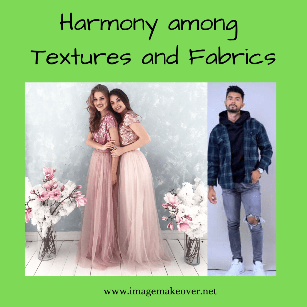
To appear harmonious, combine two or more fabric textures in terms of the mood, occasion, personality traits, and values you want to communicate. Texture may be similar to or may contrast with each other. Similar textures are relatively easy to combine but can be to repetitious, everything can look the same to the point of appearing monotonous or boring. Contrast in texture can be more interesting, effective and appealing, communicating subtle differences of mood, occasion and personality. For example tulle, satin and sequins are associated with dressy, festive or glamorous occasions, yet the difference in their surface textures adds interest to the whole outfit. The same is true in the combination of denim, flannel and cowhide, with silver buttons and belt buckle. All textures work together as they communicate dress from the casual, rugged, western outdoors. Denim paired with chiffon is not to be harmonious because extreme differences in their characteristics, use and care.
Harmony among Colors

When matching solid colors, make sure they are balanced in the same degree of warmness or coolness, such as raddish navy blue paired with a matching raddish- navy blue and not a greenish navy blue. If unmatched color differences become noticable as colors “push apart” and clash with one another. It is often difficult to match fabrics of the same weight and similar texture. You will find the differences in fabric texture can make color matching easier.
A color scheme of light values may appear more interesting with the addition of a darker color and vice versa. For example a scheme of peach and mint green can achieve an exciting balance with rust or hunter green added. Black and charcoal can become more interesting and visually balanced with a little yellow.
A color scheme of predominantly cool hues can achieve an exciting sense of harmony and is given added interest by the addition of warm hue. For example , forest green and navy blue can be livened with a small quantity of cinnamon rust or white in the color scheme.
Harmony among Shapes

Related areas, shapes or forms should be consistent. For example , if breast pockets are rounded, then hip pockets should also be and not square. If collar and cuffs are rounded , then pocket lines should be also. Interior foreground shapes can add visual weight in the area where they are placed. The number, form and size of foreground shapes are most harmonious when related to the amount of background space, dependent on the garment shape and structural seamlines. For example, too many or too large shapes overcrowded a small space. The appearance is confusing and conflicting.
Harmony among Patterns

A general goal in using clothing as a resource is to select and locate patterns in ways that enhances the body, in ways that make the figure appear more ideal. To appear harmonious, the size of a pattern needs to be in proportion and scale for the body. Compare the size of the clothing pattern to the size of the body and remember , size is relative. What appears medium on one person may appear small or large in relation to someone else. In general , small to medium sized patterns appear in scale with a smaller body. Small and medium sized pattern work well on a medium sized body. Some what larger scale patterns may work on occasion, as long as they are not so large, they begin to overwhelm. Medium to large scale patterns, moderately spaced, are harmonious on a comparatively larger body.
Harmony among Lines

To appear harmonious, the garment silhouette should appear balanced from top to bottom and side to side and the size of clothing and accessory lines needs to be in proportion and scale for the body. For example small or narrow to medium lines appear harmonious on a smaller body. Medium sized lines work well on medium sized body and medium to large lines appear in scale with a comparatively large body. The lines that divide areas inside the garment must create pleasing proportional relationships to one another and to the wearer. For example the raised waistlines of an empire style dress can visually lengthen the look of relatively short legs, bringing them into better proportion and balance with an otherwise long upper torso or to visually shorten a man’s torso, select a shorter bomber jacket and a pant with visible vertical lines, like corduroy or a subtle herringbone pattern. Interior structural lines (Woven or knitted into the fabric during manufacture) and decorative lines ( Printed onto the fabric as stripes, plaids or prints during manufacture)on the top of the garment should line up with those on the bottom. When they don’t, vertical eye moment is interrupted and attention goes to the horizontal jog, emphasizing width.
Once Harmony in clothing is achieved , you will not only feel confident about what you wear but also your will attract lots of attention and compliments from people around you.
This post is part of #BlogchatterA2Z Challenge.
If you have missed reading other posts from A2Z of Image Management series, checkout here A ,B ,C ,D ,E, F, G
@Swati Mathur

I could really relate to the harmony thing in our attire, how easy it is to get unnoticed if we are not aware buddy
LikeLiked by 1 person
Harmony yes that’s the key isn’t it. Be it patterns lines or colour. I learn so much from your posts daily.
Deepika Sharma
LikeLiked by 1 person
Wow…Harmony in so many things goes to make a perfect dress! There is so much to learn in dress designing itself.
LikeLiked by 1 person
Another post that make me think I know so less. Never thought in this line. So much to learn about dressing
Sreeparna
LikeLiked by 1 person
Harmony of textures and fabrics, wow this area is completely untouched. Never knew patterns need to be in proportion to body shape, and there are so many patterns to choose from and help enhance your look.
LikeLiked by 1 person
Wow you had covered all aspects of creating a harmony in various elements of design so well. yes, keeping these factors in mind, we can make a major difference in overall styling and look, and can feel more confident too.
LikeLiked by 1 person
I have always been paying attention to the harmony in color while dressing up, have some idea about harmony in shape, and lines as well. But never thought of harmony in patterns. Learning so much!!
LikeLiked by 1 person
I always perfect harmony while selecting my outfit…loved the way you shared about in lines and styling.
LikeLiked by 1 person
If I’ve not said it before, I’ll say it now.. This needs to be a book at the end of this month. This series has so many awesome tips
LikeLiked by 1 person
Dr. Roshan, I am thinking of an e-book but your comments has given me a confident and validated my idea. Thanks a lot
LikeLike
Great! Yes, harmony is the crux of any attire; it must align for the overall outfit’s perfect reflection. Well, detailed post-Swati.
LikeLiked by 1 person
I remember being tutored about the harmony in colours and lines by my mother and changing it according to body type. In case of patterns, asymmetric ones look good too.
LikeLiked by 1 person
I have never given a thought about how texture mattered in design. Very beautifully explained
LikeLiked by 1 person
There’s harmony in nature. The same harmony brings life to our dressing up. Good info.
LikeLiked by 1 person
yes, you said it right. The color light goes well with the dark color bottom or vice-versa. I also love this combination.
LikeLiked by 1 person
This is something I can relate to having followed.in tweens of pattern. Thank you for the insightful post
LikeLiked by 1 person
I ereally love lines and dots. I almost have them in my wardrobe
LikeLiked by 1 person
I have never given thought to Harmony
in dressing style .Harmony in so many things goes to make a perfect dress. You have great knowledge on this area.
LikeLiked by 1 person