
Hi Everyone ,
This is my 8th post for #BlogchatterA2Z challenge. Today I am discussing the importance of harmony is all the elements of design. Harmony is the sense that all of the elements of your design fit together.
Harmony among Fabrics and Textures
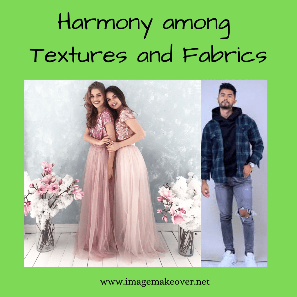
To appear harmonious, combine two or more fabric textures in terms of the mood, occasion, personality traits, and values you want to communicate. Texture may be similar to or may contrast with each other. Similar textures are relatively easy to combine but can be to repetitious, everything can look the same to the point of appearing monotonous or boring. Contrast in texture can be more interesting, effective and appealing, communicating subtle differences of mood, occasion and personality. For example tulle, satin and sequins are associated with dressy, festive or glamorous occasions, yet the difference in their surface textures adds interest to the whole outfit. The same is true in the combination of denim, flannel and cowhide, with silver buttons and belt buckle. All textures work together as they communicate dress from the casual, rugged, western outdoors. Denim paired with chiffon is not to be harmonious because extreme differences in their characteristics, use and care.
Harmony among Colors
Continue reading “#BlogchatterA2Z : “H” – Harmony in Elements of Design (A2Z of Image Management)”