

Hi Everyone,
This is my 7th Post for #BlogchatterA2Z. And today I am going to share with you A2Z about patterns in clothing. Technically speaking , pattern is not a separate element of design. Pattern is a combination of several design elements – lines and shapes in colors, arranged in or on textural material. Each element is totally interrelated when you look at the pattern design. Because pattern have their own visual effects and because you can manipulate or change the character of a pattern and its effects, it seems appropriate to treat pattern as a specific element to work with it or make it work for you.
Patterns add interest to plain surface fabric and helps coordinate two or more solid-colored items. They can create a point or area of emphasis and affect the body and mind, the way you think, feel and act. Patterns camouflage and create powerful illusions about the size, shape and weight of the body. They communicate visual meaning, message, or moods.
Remember choice in patterns becomes a visible expression of personal style and individuality.
Pattern can be categorized into two: Classy classic Patterns and Trendy Patterns
Classy Classic Patterns
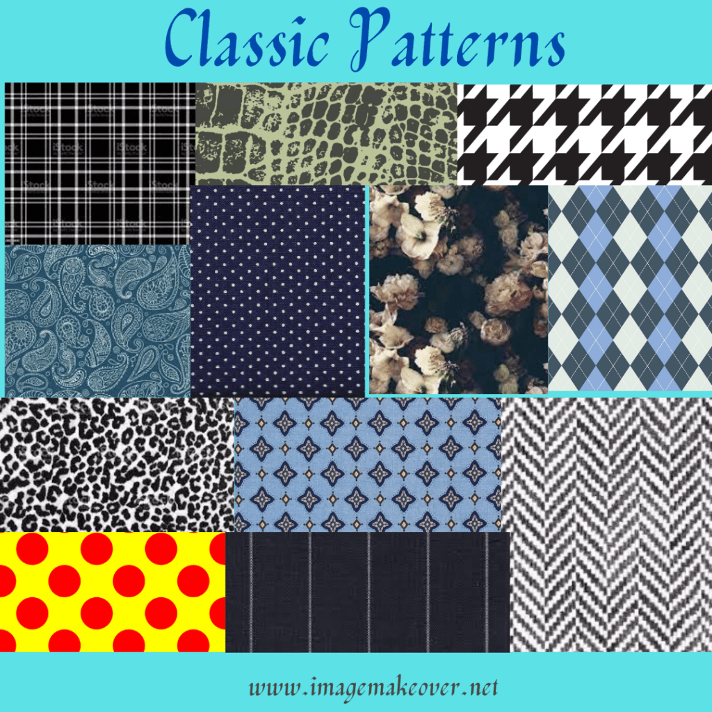
Plain, solid colors fabrics provide a foundation for your wardrobe and combine easily with other solid colors, but don’t stop there. You can count on classic patterns – in prints, stripes and plaid design on clothing, to add interest and variety needed to enliven what might otherwise becomes a dull wardrobe composed entirely of solid colors.
Classic patterns are a key to flexibility, versatility and individuality in a wardrobe. They are always in good taste and do not detract from you. Classic patterns retain their fashionability and therefore their wearability, for years. Virtually everyone can afford to buy classic patterns; style is not a matter of money.
This is not to suggest that you build a wardrobe consisting entirely of patterned fabrics. You would lose all flexibility and get tired or frustrated with this approach faster than you would a wardrobe composed of all solids. Moderation makes good sense. Plan to work with lots of solid colored clothing pieces with few terrific patterned pieces. How to recognize classic pattern? If the pattern looks familiar and seems to be always available and in style, then it is most likely a classic pattern. They are more often rendered in wardrobe neutrals, allowing them to combine easily with a wide range of clothing colors.
Trendy Patterns
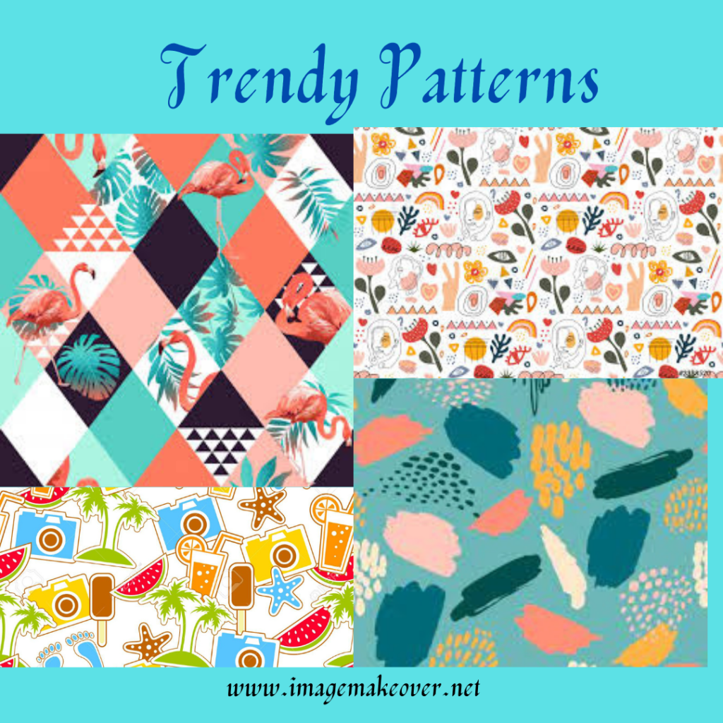
Trendy patterns are a wonderful vehicle for updating your wardrobe with minimal expense. One trendy printed garment or accessory can revitalize your entire basic cluster or wardrobe. It’s fine to have one or a few, but not a whole closet full. Classic patterns are what build more workable wardrobes.
Like costume and trendy clothing styles, trendy patterns are extreme in some aspect of design, associated with specific occasions or come and go quickly. How to recognize trendy patterns? A trendy pattern, print, stripes or plaid is usually distinctive in lines and shapes, larger in scale, bold in color and are limiting in the places it can be worn appropriately or comfortably. More trendy patterns can be included in wardrobes of people who work in creative businesses such as art, music, theater, interior design and fashion. More extreme patterns are often more acceptable for those with an active social calendar.
Lets understand the message each pattern convey with different characteristics
To feel and appear casual/informal : Wear pattern that are small to medium to large, bright colors with more color contrast. Some of the examples are embroidery, tie dye, medium to wide stripes, horizontal stripes, multicolored stripes, plaids, checks, tweed, argyle, herringbone etc.
To feel and appear dress- businesslike : Wear patterns that are small, weaving, printed and have vertical stripes. They have less color contrast, more of a darker and duller color. Some of the examples are paisley, foulard, pin stripes, glen plaid, window pane plaid, houndstooth checks , geometrics etc.
To feel and appear dressy : Wear medium to larger scale patterns with bright color and have stronger color contrast. Some of the examples are paisley, panel prints etc.
To feel and appear romantic, delicate and refined : One needs to wear monochromatic color with tiny and small prints. For example, lace, flowing abstracts, flowers, hearts, scrolls, polka dots etc.
To feel and appear sporty : One need to wear patterns from small to medium to large. Brighter colors with more color contrast. For example, Animal prints, geometric plaids, checks, horizontal stripes, embroidery, batik etc.
To feel and appear dramatic : Wear patterns which have strong contrast in hue and value. For example, Zig-Zag stripes, abstract patterns, animal prints , widely spread and single figure motifs etc.
To feel and appear mature, serious, somber and classic : One needs to wear small scale patterns, cool and dull colors with close color contrast. For example, close spaces stripes, checks, plaids etc.
To decrease attention and appear taller and slimmer – One needs to wear small to medium patterns with closer value contrast. For example, all-over pattern, vertical stripes, fine wale corduroy, geometric patterns etc.
To increase attention and appear shorter, larger and heavier : One needs to wear larger patterns with strong hue and value contrast. For example. widely spaces horizontal stripes, dots, circles etc.
While selecting the patterns you need to understand your needs and purposes appropriate for your lifestyle, personal style and for the fabric. Chose pattern with characteristics appropriate for the mood, occasion or activity, values, compatibility with your age and personality. Choose patterns that flatter your face and figure , something that look, feel and hang appropriately for the fabric and style of the garment. And the most importantly choose a pattern that will fit in well and coordinate with the existing wardrobe.
My advise, find a pattern to inspire the color scheme of an entire cluster of clothes that works for you. Take your color cues from the pattern and begin to build for your future.
This post is part of #BlogchatterA2Z Challenge.
Reads my other post from A2Z challenge here A ,B ,C ,D ,E, F
@Swati Mathur

oh my this is amazing! I normally wear plain but bold colours or very light prints. You made me ponder on my dress sense
LikeLiked by 1 person
Its so wonderful that you divided the patterns according to the occasion. That will be lot of help because one knows of patterns but not which will be used where. Very informative.
Deepika Sharma
LikeLiked by 1 person
I love prints so much and this is going to help me a lot to make selection
LikeLiked by 1 person
Yup. Definitely saving this page… because I am a clutz when it comes to my own dressing sense and often get it wrong when it comes to the shirt and occasion 🙂
LikeLiked by 1 person
Patterns as per occasions, situation and body type. Never knew it. Always wore whatever I felt looks nice. This is an eye-opener
Sreeparna
LikeLiked by 1 person
Guide for patterns, that’s interesting and wow each pattern has a message it conveys. Your posts are a complete wardrobe guide. I’m loving the latest trendy patterns a lot, but my basics always stay attached to traditional patterns especially in handlooms.
LikeLiked by 1 person
Wow again a great post. recently, I had learnt about the use of monochromatic patterns to dress classy and you post has made it clear to me. indeed minor changes in your dressing style could make a major difference in your overall appearance.
LikeLiked by 1 person
Okay let me confess today , I have round body shape and hence I need to think a lot for my clothes. This series is a saviour for me.
LikeLiked by 1 person
I like to wear trendy patterns when I am going out for dinner. Useful information about the patterns,
LikeLiked by 1 person
Patterns according to the occasion? Never thought of the concept beyond casual and formal or day and night. Thanks for sharing this useful information.
LikeLiked by 1 person
Wonderful identification of fabrics with different patterns. I love your brilliant way of mentioning every dress in the context of their reflected messages.
LikeLike
Its an enriching lesson for me, I normally pick up from the first 2/3 patterns or the dresses I see. I don’t spend much time in the shopping
LikeLike
Never thought about how patterns could be used to set the tone of a meeting. Loved how you have ended with saying that choose what works for you.
LikeLike
Such an insightful post this is. Definitely a game changer for me post this season
LikeLike
This section is inculcating great fashion sense in us. Thanks😍
LikeLiked by 1 person
To decrease attention and appear taller and slimmer and to look sober is my go to eye catchy that i look for
LikeLiked by 1 person