
Hi Everyone,
This is my 3rd post for #BlogchatterA2Z challenge and today I am going to talk about “Colour Dimensions”.
Colours are talked in terms of dimensions. Each sensation that we experience is a combination of three dimensions. They are Hue, value and intensity. Difference in these dimensions accounts for the difference we see in colours. Each dimension of colour makes specific contribution to the appearance. If we understand the effect of these dimensions we will better be able to colour match and coordinate clothing with accordance with mood and feelings.
Hue refers to the actual name of the colour. There are three kids of hues- primary, these are original and cannot be obtained my mixing other hues, secondary, these are obtained by mixing two primary colours in equal amount and tertiary, they result from a mixture of the primary and secondary hue in equal amount. Hues also refers to a colour’s relative degree of warmness and coolness. Red, orange and yellow are warm hues while blue and green are considered as cool hues.
Values refers to the relative degree of lightness and darkness of a colour.
Where are Intensity refers to the relative degree of brightness and dullness.
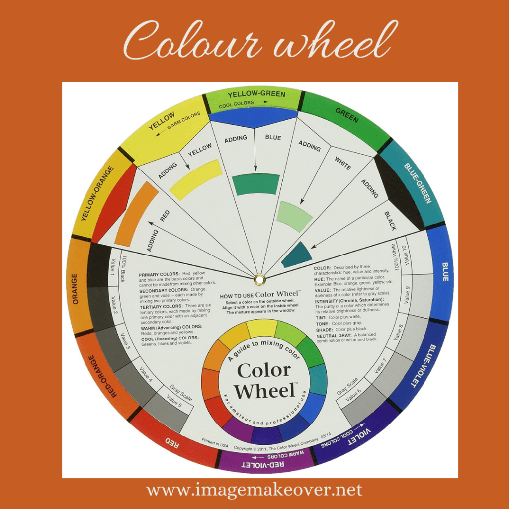
To understand which colour goes well with which other colour we should understand the use of Colour Wheel. When any colour is added with white it is called as Tint, and if any colour is added with gray it is called Tone and when any colour is added with black it is called as Shade. Hues, values and intensity from all around the colour wheel can be creatively combined and worn by all individuals. You only have to look around you. The combination are endless, limited only by the bonds of your imagination.
To achieve the individual effect you want, you can manipulate the specific combination of hue, value and intensity in your garment. For example if you want to stand out in a crowd while doing a professional presentation but do not want to appear overly bright than go for warmer colour like red but tone it down a bit by choosing darker duller red such as burgundy or wine.
Colour is the most obvious, powerful, stimulating and demanding element of design. it tends to be noticed first and remembered longest. Colour is also the most complex, creative, confusing and controversial of the elements. It evokes highly physical and emotional response, which may be conscious or unconscious. Our reactions to colour are immediate, inescapable and long lasting. While we may forget the texture and design details, we are more likely to remember the colour and our reaction to it.
The perception of colour is a very personal experience, physically and psychologically or culturally. No two people perceive a colour in exactly the same way, even within a framework of general perception.
Each of these dimensions are present in each colour you see and must be recognized to fully understand the essence and effect of colour. Right amount of colour combination can give you the look and feel, you want to portray. In combining colours in clothing, your goals to maintain a consistent theme or mood, occasion and personality, while achieving an interesting and harmonious balance among them- balance between warm and cool hues, light and dark values or bright and dull, in a variety of style lines, shapes and textures. For example some people love to see pink and fuchsia in the flower garden, but feel uncomfortable wearing them. They are psychologically more comfortable in shrimp, coral, brick and red.
Experiment a little and discover which colour are most in harmony with you, the place you go, and what you do there. As you experiment, you will discover colours you like to wear so much that they become part of your personal style- colours so specifically associated with you that they trigger an image of you in the mind of the people who knows you.
This post is part of #BlogchatterA2Z Challenge.
@Swati Mathur
